
Welcome:
This website is dedicated to the technical aspects of digital photography. Inside, you'll find discussions on topics like color spaces, colorimetry, chromatic adaptation, and input/output devices, alongside practical examples of scanning, calibration, profiling, and color management. This project originally started from my own desire to understand the underlying principles of color imaging and reproduction so I could apply them to my own photography workflows—always hoping, of course, for the best possible results.
You will also find real-world examples of device calibration, characterization, and a few tips on analyzing ICC profiles. For those who want to dive deeper, I have included some advanced sections covering the technical and mathematical sides of digital color processing.
Disclosure: These web pages were written and are presented as a non-commercial site. I am not affiliated with any brands, nor do I sell any of the products mentioned here. My genuine hope is that this site provides some useful guidance and information, whether you are a complete novice, a serious amateur, or an advanced enthusiast. Please feel free to reach out if you have any suggestions or comments.
Enjoy,
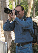
Marcel Patek

For image galleries, visit my Photography pages.


Introduction:
Over the years, the rapid growth of digital imaging has made accurate color reproduction incredibly important. Because so much of digital photography revolves around color, it really helps when both photographers and media creators understand how to describe, communicate, and interpret it accurately. Color management and digital color imaging are still relatively young fields, but they are expanding quickly into everyday life—from home entertainment and education to advertising and electronic publishing. To get a handle on color management, it helps to build a basic understanding of light and color science, combined with a bit of hands-on experience.
For a long time, things like monitor calibration, printer profiles, and scanning techniques were seen as tools exclusive to professional studios and print labs. But even at a hobbyist level, most of us just want to capture a scene and have it look as close to the original as possible when it hits our screen or a final print.
As I mentioned above, these pages offer a few tips, procedures, and "recipes" to help you spot poor profiles and figure out what might be causing off-color quality. That said, a quick word of caution: proper device calibration can get complicated. If you are chasing absolute accuracy and reproducibility, it usually requires expensive measuring gear—not to mention spending hours in a dimly lit room on a regular basis. Fortunately, there are plenty of simple, affordable, and even free tools that can still give you a massive boost in color quality.
Whenever possible, I use "budget-friendly" or free software alongside accessible measuring hardware. Some sections include free, downloadable monitor/scanner profiles, spreadsheets, or Photoshop actions to help you run these examples on your own system. Please feel free to use them—I don't impose any copyrights or licensing restrictions on my own work. However, where I have used published code, scripts, or the work of others (which is clearly noted in the files), please respect the rights of those original creators.